Mark HollandSenior AI Solutions Engineer

Payer Churn Signal App

ProductionBuilt at work for a national healthcare data company

It analyzes how M&A activity affects healthcare payer clients. It combines Gainsight, Salesforce, and ServiceNow data with AI agents that scan the news for M&A signals, then alerts account teams to at-risk clients.
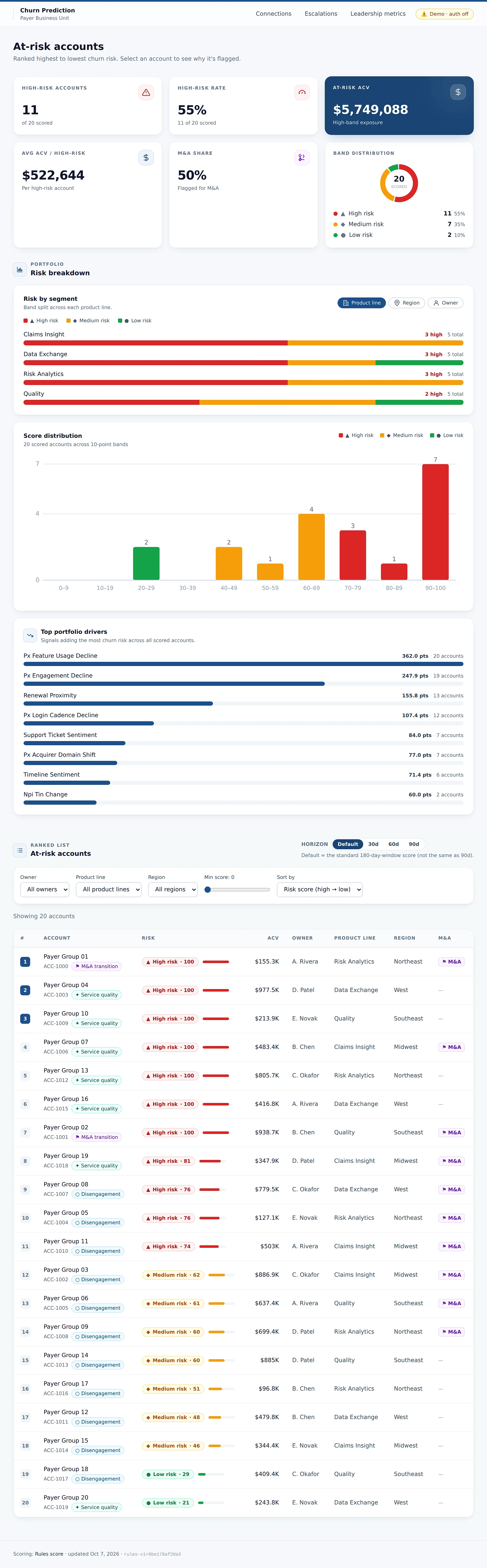
The Payer Churn Signal App's at-risk accounts dashboard on demo data: 11 high-risk accounts of 20 scored, a 55 percent high-risk rate, at-risk contract value, average value per high-risk account, a 50 percent M&A share, a band distribution chart, and risk by segment across four product lines. (opens the full screen)
The Payer Churn Signal App's at-risk accounts dashboard on demo data: 11 high-risk accounts of 20 scored, a 55 percent high-risk rate, at-risk contract value, average value per high-risk account, a 50 percent M&A share, a band distribution chart, and risk by segment across four product lines.
The at-risk accounts dashboard: how many accounts are high risk, the contract value at stake, the share flagged for M&A, and the risk split by product line. Shown with demo data.

Select the image to see the whole screen.

What it does

  • Analyzes how M&A activity affects healthcare payer clients, combining Gainsight, Salesforce, and ServiceNow data with AI agents that scan the news for M&A signals, then alerting account teams to at-risk clients.
  • Spots accounts likely to leave after a merger or acquisition, while there's still time to save them.

From my resume and the app's own materials.

Who it is for

Account teams for healthcare payer clients.

How it works

Payer Churn Signal App, step by step
  1. Gather

    Account data comes in from Gainsight, Salesforce, and ServiceNow.

  2. Watch

    AI agents scan the news for M&A signals.

  3. Analyze

    The app analyzes how M&A activity affects each payer client.

  4. Alert

    Account teams are alerted to at-risk clients.

The real screens

The Payer Churn Signal App's at-risk accounts dashboard on demo data: 11 high-risk accounts of 20 scored, a 55 percent high-risk rate, at-risk contract value, average value per high-risk account, a 50 percent M&A share, a band distribution chart, and risk by segment across four product lines.
The at-risk accounts dashboard: how many accounts are high risk, the contract value at stake, the share flagged for M&A, and the risk split by product line. Shown with demo data.
Churn dashboard summary cards: high-risk accounts, high-risk rate, at-risk contract value, and the share flagged for M&A.
Summary cards from the app. Shown with demo data.
Diagram: Gainsight, Salesforce, and ServiceNow account data and AI agents that scan the news for M&A signals lead to a risk score with its drivers for each client, and then to an alert for the account team.
Design diagramAccount data and news signals become one risk score per client, with its drivers, and an alert for the account team.

The decision that matters

Alerts go to account teams

The app's output is an alert to the account team about an at-risk client, drawn from Gainsight, Salesforce, and ServiceNow data and the M&A signals AI agents find in the news.

Built with

  • Gainsight
  • Salesforce
  • ServiceNow
  • AI agents that scan the news